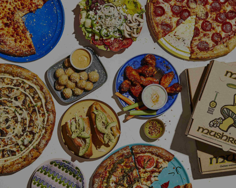
Mellow Mushroom
A fresh website and integrated menus for everyone’s favorite trippy pizza brand.


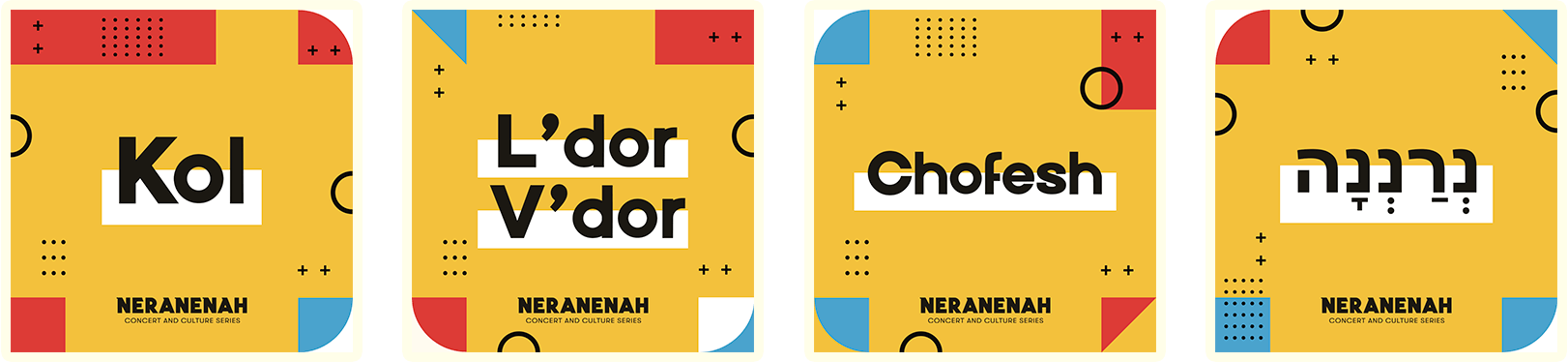
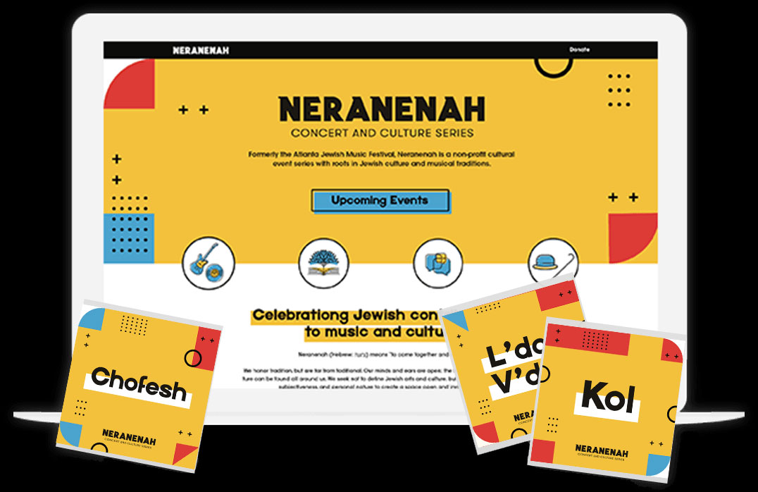
A new identity for the former Atlanta Jewish Music Festival as they pivoted toward a more modern and flexible festival model.
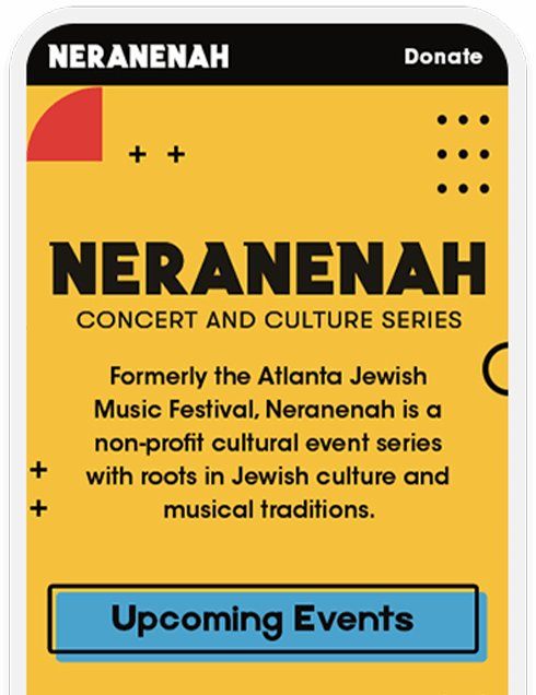
With a new name and approach toward programing, Neranenah was in need of a refreshed identity, internal language, and principles to help propel their mission for future growth.
We created an entirely new look and feel for the brand and established new language and visual elements to solidify their updated approach.
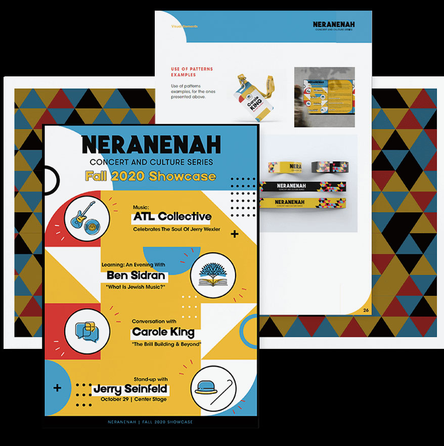
Neranenah focuses on music with an added emphasis on Jewish culture, knowledge, and comedy. We created a brand system which represents each of these focus areas and implemented a modern and colorful look to appeal to a broad audience.
We worked closely with Neranenah’s leadership team and advisors to establish brand pillars and foundational language which continues to help drive the brand presence today across all touchpoints.
had a vision in mind but wasn’t really sure if it was attainable or realistic. 3 Owl helped me realize it was both; they really nailed both the rebranded name and look all while encompassing that vision. They’re very creative, thoughtful, and flexible; 3 Owl thinks outside of the box. They stand apart from their competitors because their approach was to work together with us to find the right name; not just tell us our new name.